- We were given a presentation on signs, symbols & omens.
- FOR EXAMPLE: Red sky at night, Shepards delight
- Nigel used an example of his son’s illegible drawing which was called “Billy in the stream” as an example of how things mean different things for people
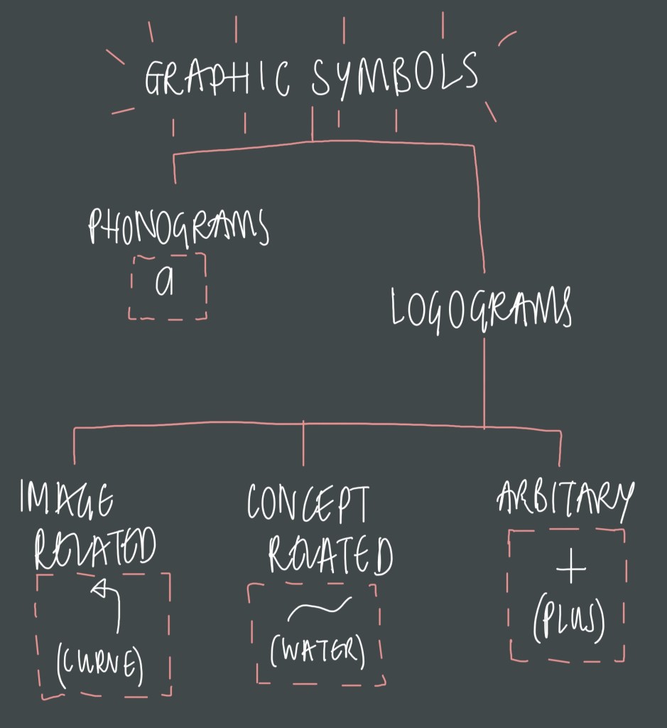
[LITERAL MARKS = ABSTRACT MARKS]
- EYE = <O>
- O = Circle (LITERAL), journey, continuous, focus,, infinity (ABSTRACT)
- The street “John Islip” = eye, slip (slip form a tree)
SIGN & SYMBOL
- SIGN:
- Life can depend (specific)
- message
- SYMBOL:
- Represent
- different meanings to different people (non specific)
- Logos/symbols must be visible for miles so your logo can be communicated
- It needs to be able to put its message across @ different distances
- The way in which you put things across represents the service.
- Presentation = key
- Coats of arms = branding of a country
- Plus ultra/ non ultra = nothing beyond
- Develop branding
- Symbols at churches mean stories
- Signs outside shops like barbers as a recognisable place.
- Some companies change logos to create friendliness like BP – focused target market aimed logo
- Has to be able to be reduced but still recognisable
- Have the same effect at different scales
- Font can have a great effect or forwardness
- Logos create differentiation/make something recognisable
- History of graphic design
- needs to be re-printable
- Trademark act – 1875 (red triangle)
- EAG visual mark is continuous throughout
- Henry Beck’s Tube Map = simplify and organise
- Macdonald’s “speede” cartoons/mascots
- Golden Arches @ Macdonald’s
- Universal safety signs
THE USE OF ANIMALS TO SYMBOLISE:
- Penguin books – Black and white
- Jaguar car – Sleek, fast, streamline
- HMV – Listening to the sound
- Visual recognition – Crown Jewels
- Positive + negative = national grid
- BEWARE of mix interpretation
TYPOGRAPHIC:
- V&A – Museum, represents old + modern mix
- Doesn’t have to be obvious
- Macdonald’s
- Mercedes
CONCLUSION…
- There are a variety of interpretations in society
- An example of how symbols can be developed = hieroglyphs/markings—->western alphabet (oxhouse = alphabet)
Click to access logos_seminar_2019_lo_res_3.pdf
“LOGO DESIGNING”
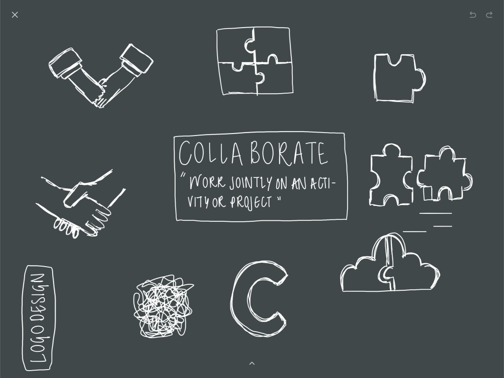
- My initial designs tend more to be images which I simplified to represent the meaning of “collaborate”. However I felt they were unoriginal and cliche which made them boring.
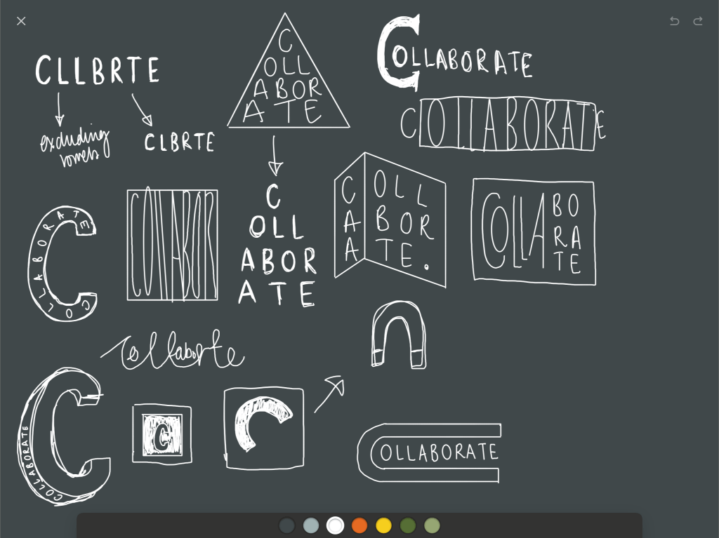
- I then started to incorporate the word collaborate and explore how I could represent the meaning of the word , for example the letter pyramid of the word to represent the words coming together, however with this logo and a lot of my others, the word would not have been visible at different scales and is also to “wordy” and would not catch someones eye.
- When we handed in our first 33 logos my group all used alternative styles when designing the logo.
- Me and Michaela focused more the word, Jairun and Anna focused more on shapes. This inspired me to incorporate more shape into my logo and use them to represent collaborating.
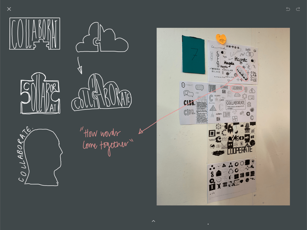
- From the feedback we got we were told to focus on “How words come together”, so from this I tried to think of other words to represent the meaning of collaborate that were less wordy.
- I came up with “we” and “us” and decide to dissect the words and physically see how they come together, to create a more effective logo because the word isn’t as long.
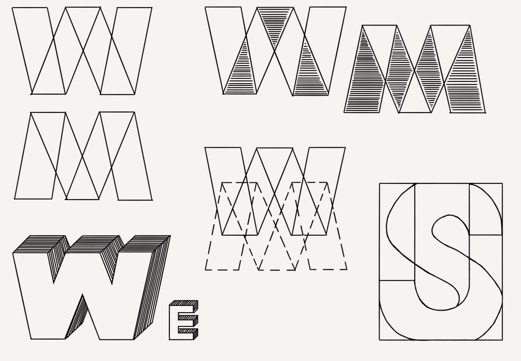
AFTER TABLE TOP TUTORIAL…
- FEEDBACK:
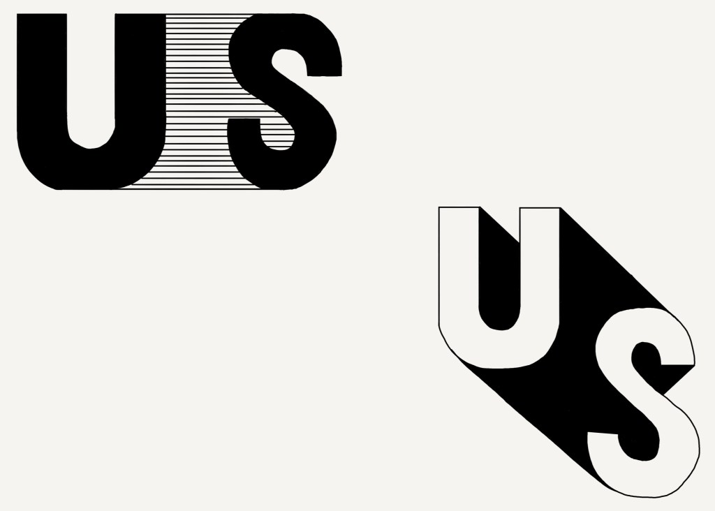
- “US” looked like United States which took away from what the logo was representing for whoever viewed it. I learnt form this that we had to look at our logos from different perspectives, as things can be seen differently depending on their knowledge.
- Nigel also said that he liked how the u and s were connected to show people working together and be one to create a final piece/design.
- Logos with thin lines don’t stand out as much/ aren’t as bold so they don’t catch peoples attention or they don’t remember what they represent, which is a logos goal.
FINAL LOGO DEDISGNS…
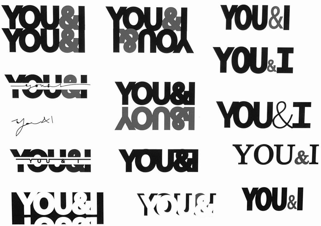
- I really liked the idea of staying away from cliche images for the logo and decided to experiment with grey to separate and make the logo more interesting which definitely separated the you and I.
- I working with shadows took away from the type so it was less wordy however wasn’t as successful for putting the meaning across.
- Nigel liked the logos where the words were connected to show collaboration.
- I then experimented with different fonts as Nigel said the fonts were a bit boring so I used different sizes and stroke thickness to create different aspects of the logo like different designers.
“THE CHOSEN ONE”

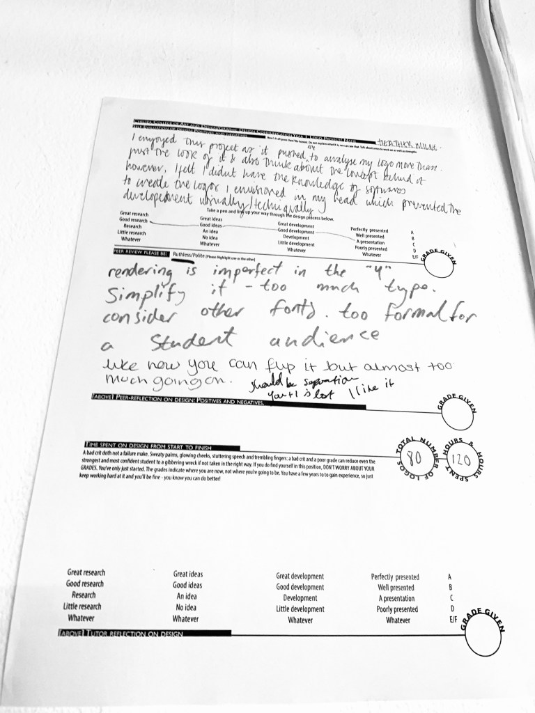
- From the feedback I learnt that my logo didn’t reach the target audience, I felt it looked successful minus the point where the I and Y connect however it was too formal for the students to remember because u focused on the aesthetic rather than it being interactive.
- I think my logo looks good however was unsuccessful as it didn’t interact with my peers and the idea behind the logo didn’t resonate with them instantly which logos should.
