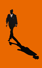
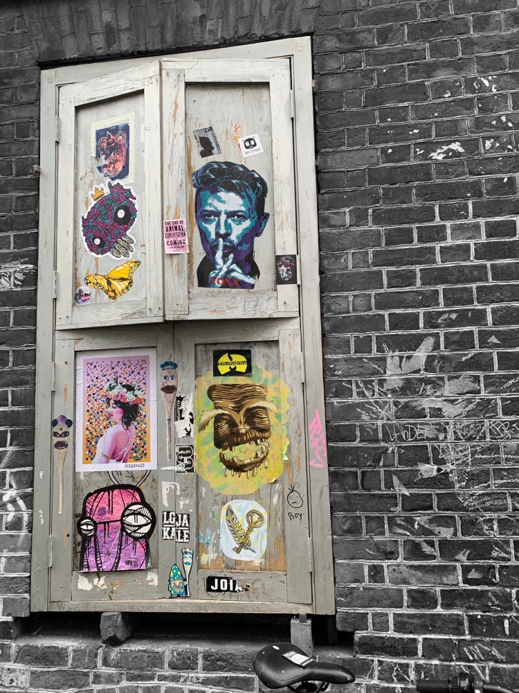
I wanted my image to have as much context as possible so it was self explanatory and hard hitting but also instantly recognisable. I experimented with repetition to represent to continuous cycle.
However, the repetition diminished the detail that represented the cost of periods and how expensive it is to be a woman. So I went with the three so it was balanced and focused on the bloody tampon which addresses the normalisation of periods.
I am happy with my final piece as I feel my development of my illustrator skills is shown. I feel it looks crisp and easily recognisable.
I was stunned by the facts I found out about period poverty in the UK. We know period poverty is prominent issue in developing countries so to find out how prevalent it is in the UK is quite frankly atrocious. As a designer I would like bring awareness to issues like this.
Girls with special needs and disabilities disproportionately do not have access to the facilities and resources they need for proper menstrual hygiene
Free Periods founder, Amika George, started one advocating free period products for all children who receive free meals, which currently has over 250,000 signatures.
A recent survey found that 42% of 14- to 21-year-olds in the UK said they had used makeshift sanitary protection, with some saying they had used socks, other fabric or paper as emergency replacements.
Up to 500 million women and girls are living each month in period poverty
I found After Effects hard to work with, however loved the final effect. I do wish I tried to take a more technical approach by using more animation to make it more interesting and express more context.
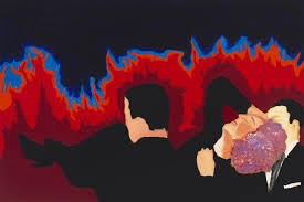
I struggled to mix the bright colours with a more interesting type however I didn’t feel it matched Drexler’s style as she uses vague shapes but uses the bold colours to define them. I use this technique to emphasise the words rather than the shapes, as well as the acrylic paintings to help visualise the context behind Drexler’s words.
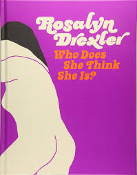
American visual artist, Obie Award -winning playwright, award winning Emmy screenwriter, and former professional wrestler. As a female artist in the 60’s she received no offers because “women[sculptors] were not bankable at the time.” She made a swift shift to painting in an attempt to
gain more offers. She searched through old magazines, posters, and newspapers to source imagery for her paintings. Her self-taught process consisted of blowing up images from magazines and newspapers, collaging them onto canvas, and then painting over them in bright, saturated colors. She also has a fondness for Elmer’s Glue in her work, saying it “doesn’t get enough credit for its role in art.”
She works with bright colours and collage, combining the two mediums give an alternative approach to pop art and showing the context behind the piece.
Our brief was to create a banner for Chelsea about something that was important to us. I believe that at this moment in time people tend to just show they support something by posting a picture or changing their profile pic with a filter about the cause rather than being proactive and making a change.
Banners are brief they need to resonate with people instantly, I tend to draw to more minimalistic banners with just enough context and big and bold typography to encourage people to do something.
Here is my first attempted, I liked the contrast with the pink but it felt unconnected with the image and got lost due to the repetition and failed to put the message across.
If I wanted to develop this banner so it had a greater effect on the target audience I would make the image clearer so it was solely the workers making the world.
Although I like typography I don’t know much about the technical side of it. Over this project I have learnt more about structure, styles and similarities between fonts.
With Sakis & Eva we had to research “Garamond”.
Garamond is a group of many old-style serif typefaces, named for sixteenth-century Parisian engraver Claude Garamond.Garamond-style typefaces are popular and often used, particularly for printing body text and books.
Who is Garamond?
Born in Paris, France in 1490, Garamond started his career out as an apprentice for the Parisian punch-cutter and printer, Antoine Augereau in 1510 . It was during this early part of the 16th century that Garamond and his peers found that the typography industry required unique multi-talented people. This way they could produce fine books. Many of the printers during that time period were able to master all or most of the artistic and technical skills of book production from type design to bookbinding. Two things that really interest me.
The Adobe Garamond font family has been widely used, including the instantly recognizable Google logo. Ruth Kedar, the graphic designer commissioned by Sergey Brin and Larry Page to create the image realized from an early stage that Google would require a logotype rather than a simpler graphic logo. The insignia underwent several design phases – with Garamond as the font each time – until the modern, colorful version was finalized. Many very famous books have been set in Adobe Garamond; the Dr. Seuss range of books and the legendary Harry Potter volumes are just two examples.
Editorial design & magazines has always been one of my favourite aspects of graphic design. This is due to the structure used within magazines. the layout and grid structure is way more important than I originally thought.
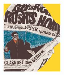
We picked out a pages in the magazine drew out the structure and used an old vintage magazines to create a collage based ion the structure but also tones of the original page.
This exercise showed me how different structures can be effective depending on whether the page is heavily photographic or words. It has also encouraged me to think about alternative layouts.
LINO:
The brief was for us to create a typographic print about why we love or hate the library. Personally, I love Lino prints I like the physicality of cutting out your print, I find it therapeutic but also I feel it gives the typography a better human connect because no matter how perfect you cut it, the design will always look a little rough around the edges. In my opinion Lino printing connects better with the viewer.
I chose this phrase because since I was younger I would always buy books that were designed well, through colours, illustration or minimalism. However, I would find that I didn’t actually like the book or read it because the story inside didn’t interest me. I still find I do this now.
I chose to go to University in London because, I felt it would provide me with a much richer environment which I could take inspiration from, through the cultures, food markets, vintage stores, independent businesses, the specific identities of certain areas such as Chelsea to Shoreditch.
Different areas have different ways of connecting and communicating with people through design. In Shoreditch I noticed graffiti was a major factor in how people advertised & expressed themselves, Whereas in SW1 it tends to be a lot less fluid, more rules & less colour and experimentation with typography. It got me thinking about how typography and the use of it in an area such as Shoreditch, tells a story about the type of people that live, visit or work there.
The typography on Brick Lane tended to be more expressive and colourful compared to the Spitalfields, which is a more affluent area due to the larger companies based in the area, which also means the area is busier, and more commercialised. Ultimately this affects the style of typography creating a more minimalistic and more professional then in typography.
I found this day out so helpful in understanding the effects of typography as well as finding inspiring new ways off approaching design. Whenever I am feeling uninspired I will take a (long) trip to east London for a hit of creativity.
Since I was in primary school my mum has called me “the gel pen girl” because I have always spent hours caring more about how my work looked rather than the actual work it self (most of the time). I would think about which colours would compliment each other and help me remember the diagram more in Science & in maths I would sit and try and draw the most perfect “a” I could, no wonder I finished my jotters faster than everyone else, spend every lesson drawing somewhere near 35 letter a’s – not quite the best use of my time.
However I do feel like it helped me understand that the way you can design something can have an impact on how you remember them which is important in graphic design communication.
As time went on, I developed into the “tip ex girl”, constantly worried about designing something and not liking it or changing the original design. However, since starting the course I have already started to break out of these habits. By experimenting and adapting designs, considering the context and the effect of certain features on the viewer or target audience, rather than whether it just looks nice. Hopefully this means my skills and approach to designing will improve and develop.
THIS HAS FELT REFRESHING & I CANT WAIT BECOME A DESIGNER (Not a gel pen girl).
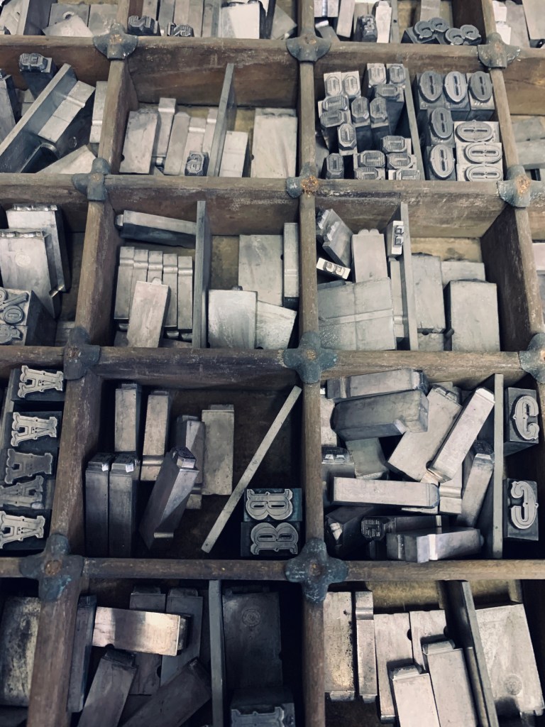
Due to Chelsea’s great connections it allowed us to visit New North LetterPress in Shoreditch. To say this was an eye-opener would be an understatement. There is a difference between seeing typography on a screen and seeing the draws upon draws of different fonts, letters and decorative blocks from Victorian times to 3D printed letter blocks. Like a typographic firework.
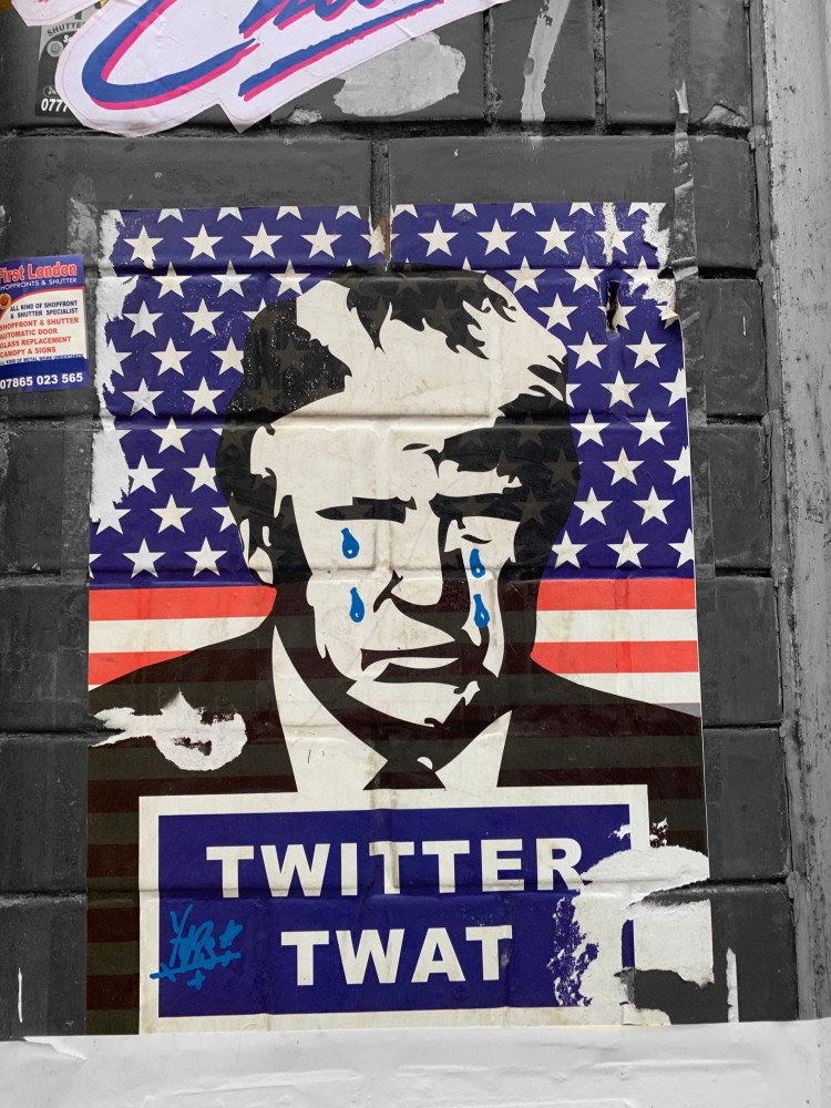
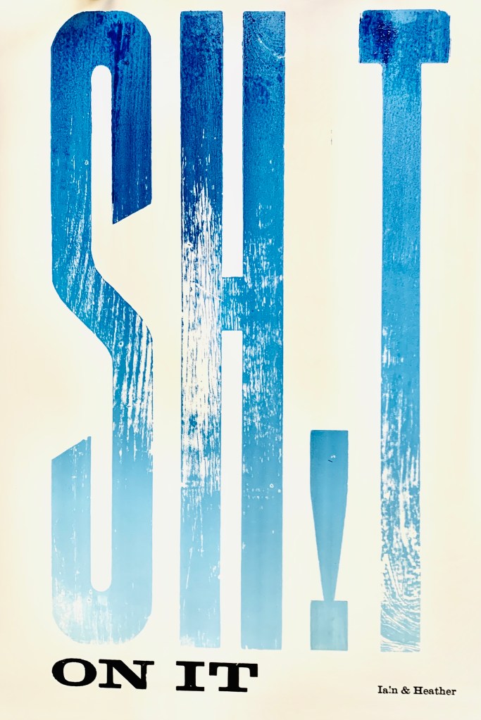
The brief was “PROTESTS”, which is possibly my most favourite topic to explore through design as I feel passionate about A LOT (mainly how much I dislike Trump). However I was drawn towards the biggest font the press had…only problem was that they didn’t have the whole alphabet and the only word we could come up with was explicit.
Exploring with gradients and mixing the inks was interesting especially with the texture of the wooden blocks.
THE FOCUS.
Cancer is crap, so why not crap on cancer. With a very simple stool sample you can discover early signs of colon cancer without having to undergo any examination. You could wipe-out the worry with just one visit to the loo and just one no2.
We wanted to bring awareness to check ups & monitoring your health with a print that would catch peoples eye.
However I think visually we could have related it more to the topic and not used blue.
After visiting the letterpress it has definitely strengthened my love for typography and print, it has also helped me think more about the intricate and specific process, while also about the prints affect on the viewer.