STRUCTURE:
Editorial design & magazines has always been one of my favourite aspects of graphic design. This is due to the structure used within magazines. the layout and grid structure is way more important than I originally thought.
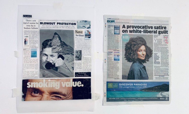
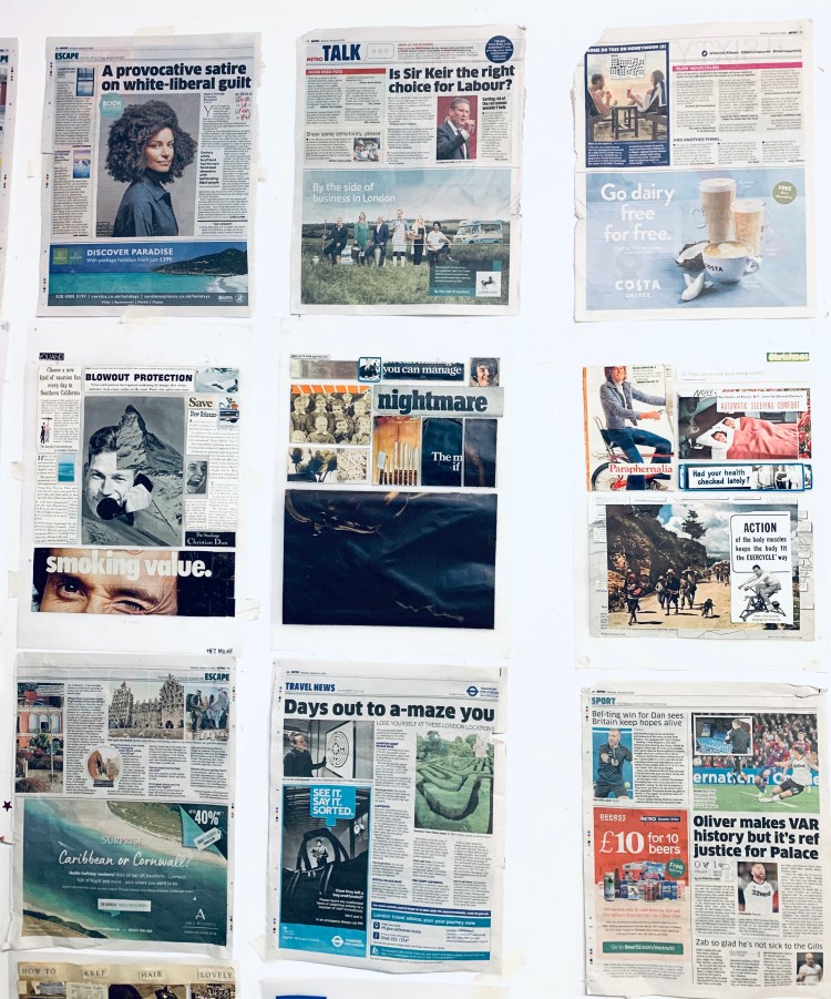
We picked out a pages in the magazine drew out the structure and used an old vintage magazines to create a collage based ion the structure but also tones of the original page.
This exercise showed me how different structures can be effective depending on whether the page is heavily photographic or words. It has also encouraged me to think about alternative layouts.
LINO:
The brief was for us to create a typographic print about why we love or hate the library. Personally, I love Lino prints I like the physicality of cutting out your print, I find it therapeutic but also I feel it gives the typography a better human connect because no matter how perfect you cut it, the design will always look a little rough around the edges. In my opinion Lino printing connects better with the viewer.


I chose this phrase because since I was younger I would always buy books that were designed well, through colours, illustration or minimalism. However, I would find that I didn’t actually like the book or read it because the story inside didn’t interest me. I still find I do this now.
