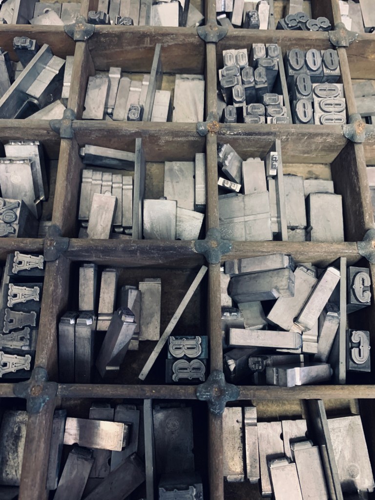
Due to Chelsea’s great connections it allowed us to visit New North LetterPress in Shoreditch. To say this was an eye-opener would be an understatement. There is a difference between seeing typography on a screen and seeing the draws upon draws of different fonts, letters and decorative blocks from Victorian times to 3D printed letter blocks. Like a typographic firework.
Visit their website: http://new-north-press.co.uk
The brief was “PROTESTS”, which is possibly my most favourite topic to explore through design as I feel passionate about A LOT (mainly how much I dislike Trump). However I was drawn towards the biggest font the press had…only problem was that they didn’t have the whole alphabet and the only word we could come up with was explicit.
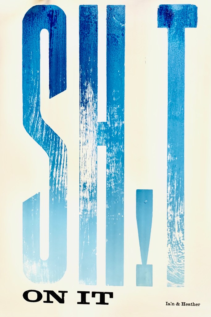
Exploring with gradients and mixing the inks was interesting especially with the texture of the wooden blocks.
THE FOCUS.
Cancer is crap, so why not crap on cancer. With a very simple stool sample you can discover early signs of colon cancer without having to undergo any examination. You could wipe-out the worry with just one visit to the loo and just one no2.
- We wanted to bring awareness to check ups & monitoring your health with a print that would catch peoples eye.
- However I think visually we could have related it more to the topic and not used blue.
After visiting the letterpress it has definitely strengthened my love for typography and print, it has also helped me think more about the intricate and specific process, while also about the prints affect on the viewer.

