I chose to go to University in London because, I felt it would provide me with a much richer environment which I could take inspiration from, through the cultures, food markets, vintage stores, independent businesses, the specific identities of certain areas such as Chelsea to Shoreditch.
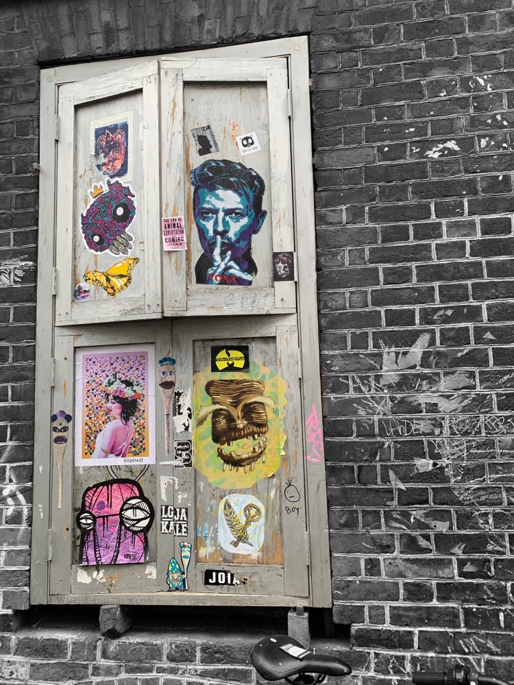
Different areas have different ways of connecting and communicating with people through design. In Shoreditch I noticed graffiti was a major factor in how people advertised & expressed themselves, Whereas in SW1 it tends to be a lot less fluid, more rules & less colour and experimentation with typography. It got me thinking about how typography and the use of it in an area such as Shoreditch, tells a story about the type of people that live, visit or work there.
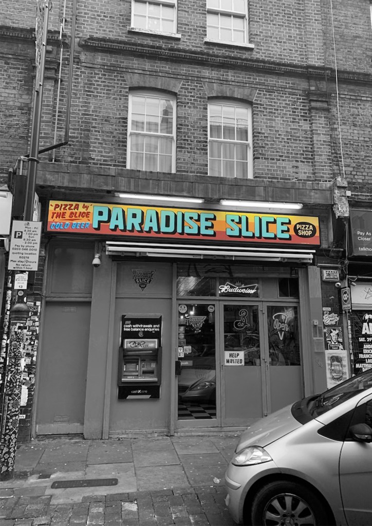


The typography on Brick Lane tended to be more expressive and colourful compared to the Spitalfields, which is a more affluent area due to the larger companies based in the area, which also means the area is busier, and more commercialised. Ultimately this affects the style of typography creating a more minimalistic and more professional then in typography.
I found this day out so helpful in understanding the effects of typography as well as finding inspiring new ways off approaching design. Whenever I am feeling uninspired I will take a (long) trip to east London for a hit of creativity.
